Evidence of global warming is everywhere.
Recently, I needed to download some ozone data from the NOAA Global Monitoring Laboratory weather balloons located in Boulder, CO. Maybe because I’ve never had what amounts to a traditional training in meteorology, nor have I ever participated in the launch of a weather balloon, looking at raw balloon data has always felt particularly novel for me. But, unlike model or satellite products it’s easy to understand what the data is, and it’s easy to see how it’s collected – someone launches a balloon and the attached sensor collects data about the barometric pressure, temperature, relative humidity, and in this case, ozone concentration, as the balloon moves up in the atmosphere. Simple as.
Trends in Temperature at the Boulder Balloon Sounding
For this project, I only needed a few years of data. But the files are small and were easy to download, so I went ahead and downloaded all of it going back to 1967. It looks like the balloon launches were fairly frequent with some gaps. Ultimately there were 2107 flights with data hosted on the NOAA webpage.
For a record this long, we should see a meaningful sign of climate change from increasing CO2 concentrations in the atmosphere caused by the combustion of fossil fuels. So, let’s see what it looks like:
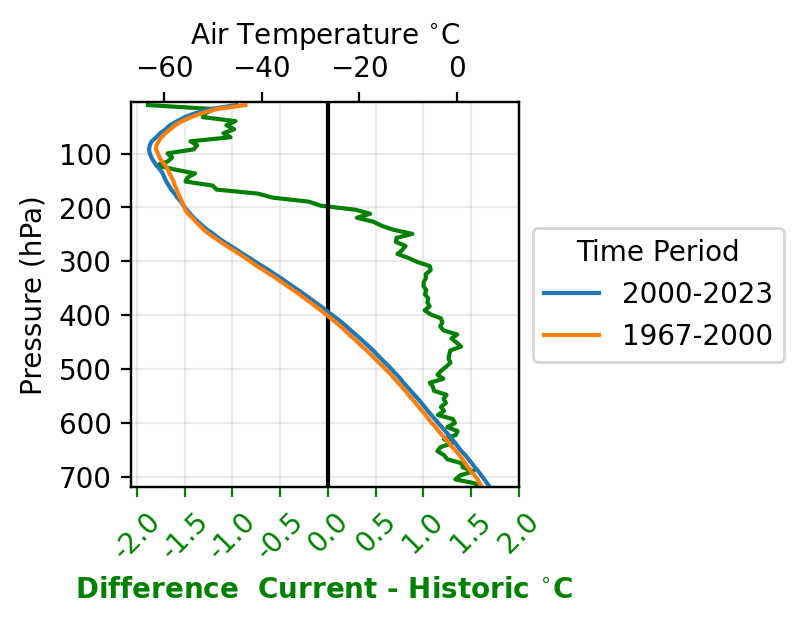
Unsurprisingly, the balloon sonde at Boulder shows a warming trend as one might expect. Keep in mind that the y-axis is atmospheric pressure (high pressure –> lower elevation, and sea level pressure is ~1000hPa, also keeping in mind we are located high in the Rocky mountains in Boulder,CO).
There’s clearly a warming signal lower in the atmosphere and a cooling signal up high starting around 200 hPa. This is exactly what we expect with climate change. Greenhouse gases are trapped at the lower levels in the atmosphere, keeping the Earth’s heat from escaping upwards into the upper levels and eventually into space. On one level it’s very interesting to see the theory bourne out so clearly from this quick analysis of data, and on another level, incredibly disturbing.
Trends in Ozone (O3) at the Boulder Balloon Sounding
Finally, we may as well look at the trend in ozone concentration (measured in ppmv, or parts per million volume).
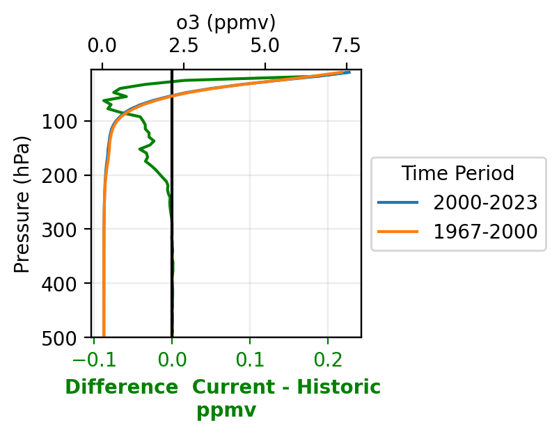
Ozone is mostly found at the upper levels of the atmosphere. We can see that, there is about a .1 ppmv decrease in ozone concentration around 50 hPa in the atmosphere in 2000-2023 compared to 1967-2000. This is indeed the famed ‘ozone hole’ that was well-known and discussed in the 90’s and early 2000’s but less so now. It’s likely that the trend is now reversing.
Also, I don’t fully trust the data much above ~50hPa, as the data have been interpolated at the maximum altitude of the balloon may change from flight to flight. So it’s possible that the numbers at the upper and lower limits are more suspect.
Code
The code for doing this is posted below:
import requests
from bs4 import BeautifulSoup  # needed to download web data
import os
import glob
import matplotlib.pyplot as plt
import xarray as xr
import numpy as np

# Function to download and save data from a given link
def download_data(link, save_path):
    response = requests.get(link)

    if response.status_code == 200:
        with open(save_path, 'w', encoding='utf-8') as file:
            file.write(response.text)
        print(f"Data from {link} saved to {save_path}")
    else:
        print(f"Failed to retrieve data from {link}. Status code: {response.status_code}")

# URL of the website with the table of links
website_url = 'https://gml.noaa.gov/aftp/data/ozwv/Ozonesonde/Boulder,%20Colorado/100%20Meter%20Average%20Files/'


# Make a request to the website
response = requests.get(website_url)

if response.status_code == 200:
    soup = BeautifulSoup(response.text, 'html.parser')

    # Locate the table containing links
    table = soup.find('table')

    # Assuming links are in the 'a' tags within the table
    links = table.find_all('a')

    # Create a directory to save the text files
    if not os.path.exists('downloaded_data'):
        os.makedirs('downloaded_data')

    for link in links:
        href = link.get('href')
        if href.endswith('.l100'):
            # Construct the absolute URL if the link is relative
            full_url = website_url + href if not href.startswith('http') else href

            # Generate a filename based on the link
            filename = os.path.join('downloaded_data', os.path.basename(href))

            # Download and save the data
            download_data(full_url, filename)
else:
    print(f"Failed to retrieve the website. Status code: {response.status_code}")


#### this is the code to read in the data and plot it

def combine_and_rename(df):
    # Get the column names
    column_names = df.columns.tolist()

    # Get the first row values
    first_row = df.iloc[0].tolist()

    # Combine the column names and the first row values
    new_column_names = [f"{column} - {value}" for column, value in zip(column_names, first_row)]

    # Rename the dataframe columns
    df.columns = new_column_names

    return df.iloc[1:,:]

# this function will convert the csv to an xarray dataset
def xr_from_csv(f):
    # this try except block is just because a few of the csvs are formatted differently
    try:
        df = pd.read_csv(f, skiprows=26, sep='\s+', engine='python')
        df = combine_and_rename(df)
        df = df.astype(float)
    except ValueError:
        df = pd.read_csv(f, skiprows=27, sep='\s+', engine='python')
        df = combine_and_rename(df)
        df = df.astype(float)

    # keep going
    tstr = f.split("/")[-1].split("_")

    # this is the time ...
    thetime= pd.to_datetime(tstr[1] + "-" + tstr[2] + "-" + tstr[3])

    # now do some fixing of the data...
    df = df.sort_values(by='Press - hPa')
    # interpolate it to a standard pressure grid
    # the actual pressure levels change a little bit from day to day
    # but most of the ozone is up high so this prob doesn't matter
    df_interpO3 = np.interp(np.linspace(10, 750, 100), df['Press - hPa'], df['Ozone.1 - ppmv'])
    df_interpTC = np.interp(np.linspace(10, 750, 100), df['Press - hPa'], df['Temp - C'])
    df_interpRH = np.interp(np.linspace(10, 750, 100), df['Press - hPa'], df['Hum - %'])

    xrds = xr.Dataset(data_vars={"rh":(["time", "pressure"], df_interpRH.reshape(-1,100)),
                                 "tc":(["time", "pressure"], df_interpTC.reshape(-1,100)),
                                 "o3":(["time", "pressure"], df_interpO3.reshape(-1,100)),
                                 },
                      coords={"pressure":(np.linspace(10, 750, 100)),
                             "time": np.array([thetime])})

    #ds_list.append(xrds)
    return xrds

### run the above codes and concatenate the files into one xarray dataset
yearlist = range(1967, 2024)
xrds_list = []
name = "all_sondes_%s-%s.nc"%(1967, 2023)

for yr in yearlist:
    flist = list(glob.glob("./downloaded_data/*%s*.l100"%yr))

    for f in flist:
        xrds_list.append(xr_from_csv(f))

    print(yr)

# now lets' concat and save the file
xr.concat(xrds_list, dim='time').to_netcdf("./ozone_files/"+name)

# now do the plotting

name = "all_sondes_%s-%s.nc"%(1967, 2023)
allds = xr.open_dataset("./ozone_files/"+name)
allds=allds.sortby('time')


historic=allds.isel(time=slice(0,800)).median(dim='time')#.tc.plot(y='pressure', color='red')
current=allds.isel(time=slice(800,2100)).median(dim='time')#.tc.plot(y='pressure', color='blue')

#### Temperature plot
fig,ax=plt.subplots(figsize=(2.5,2.5))
ax2 = ax.twiny()
ax.plot(current.tc - historic.tc, allds.pressure, color='green')
ax.axvline(0, color='black')
ax.tick_params(axis='x', colors='green')

ax2.plot(current.tc, allds.pressure, label='2000-2023')
ax2.plot(historic.tc, allds.pressure,  label='1967-2000')

leg=ax2.legend(loc='center left', bbox_to_anchor=(1, 0.5))


leg.set_title("Time Period")

ax2.set_ylim(720,5)
ax.set_ylim(720,5)
ax.set_xticks([-2,-1.5, -1, -.5, 0, .5, 1., 1.5, 2.])
ax.set_xticklabels(ax.get_xticks(), rotation=45)
ax.set_yticks([700,600,500,400,300,200,100])
ax.grid(alpha=.25)
ax2.set_xlabel("Air Temperature $^{\circ}$C")
ax.set_xlabel("Difference  Current - Historic $^{\circ}$C ", color='green', fontweight='bold')
ax.set_ylabel("Pressure (hPa)")

#### Ozone plot
fig,ax=plt.subplots(figsize=(2.5,2.5))
ax2 = ax.twiny()
ax.plot(current.o3 - historic.o3, allds.pressure, color='green')
ax.axvline(0, color='black')
ax.tick_params(axis='x', colors='green')
ax2.plot(current.o3, allds.pressure, label='2000-2023')
ax2.plot(historic.o3, allds.pressure,  label='1967-2000')
leg=ax2.legend(loc='center left', bbox_to_anchor=(1, 0.5))
leg.set_title("Time Period")

ax2.set_ylim(500,5)
ax.set_ylim(500,5)
ax.grid(alpha=.25)
ax2.set_xlabel("o3 (ppmv)")
ax.set_xlabel("Difference  Current - Historic \n ppmv ", color='green', fontweight='bold')
ax.set_ylabel("Pressure (hPa)")