I’m increasingly finding that scatterplots are not always the best data visualization tool, particularly when you’re dealing with datasets with lots of points. But I still see them published in papers all the time, even when they are not the appropriate choice (and I am probably guilty of this!).
The reason this is problematic is that dense data regions are not well represented, since scatter points start to overlap and saturate. In many datasets, there might be one really dense region and a bunch of outliers —– if nothing indicates where the dense region really is, then we have a skewed perception of the data. Adjusting the “alpha” of the points rarely helps, as just a few points of overlap will cause the color to saturate. The reader/viewer will have no idea if, for instance, 1000, 100, or 10 points are plotted on top of each other.
This is why plotting 2-D histograms is almost always a better choice when the number of data points is large. The density of points is represented by the color of the region, making the true relationship between the variables much clearer.
Here’s an illustrative example of a misleading scatter plot:
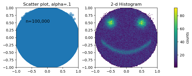
Both plots use the exact same data, and as you can see, some important features are completely invisible in the scatter plot, even though each data point only has a transparency of 10%.
The code snippet below reproduces the figure above. Note that I’m using the “histogram2d” function from numpy. This is also implemented in matplotlib as the pyplot.hist2d function. Matplotlib also has the “hexbin” funciton, which does more or less the same thing, but uses hexagons instead of squares. I prefer the squares, but that’s just personal preference.
import numpy as np
import matplotlib.pyplot as plt


np.random.seed(0)

# Generate random coordinates within the unit circle
theta = np.random.uniform(0, 2*np.pi, size=100000)
r = np.sqrt(np.random.uniform(0, 1,   size=100000))
x = r * np.cos(theta)
y = r * np.sin(theta)


## make the smile
x0 = np.random.uniform(-.8,.8,10000)
y0 =  .6*(x0 - x0.mean())**2 - .5 + np.random.randn(10000)*.05

# make the eyes
x1 = np.random.normal(size=(10000))*.1 +-.5 # left
y1 = np.random.normal(size=(10000))*.1 +.5 # left

x2 = np.random.normal(size=(10000))*.1 +.5 # right
y2 = np.random.normal(size=(10000))*.1 +.5 # right


# join them all together
all_the_xs = np.concatenate((x, x0,x1,x2))
all_the_ys = np.concatenate((y, y0,y1,y2))

# now plot

# make a scatter plot
fig, ax = plt.subplots(1,3, figsize=(8,3), gridspec_kw={'width_ratios': [1, 1, .05]})
ax[0].scatter(all_the_xs,all_the_ys, alpha=.5)


# make a 2d histogram
count, ybins, xbins = np.histogram2d(all_the_xs, all_the_ys, (100,100), density=False)
im=ax[1].pcolormesh(ybins, xbins, np.where(avg==0, np.nan, count).T)  # note that you have to transpose the array
fig.colorbar(im, cax=ax[2], orientation='vertical', label='counts')


# adjust the limits of the axes
for axx in [ax[0], ax[1]]:
    axx.set_xlim(-1,1)
    axx.set_ylim(-1,1)

# adjust space
plt.subplots_adjust(wspace=.4)

ax[0].set_title('Scatter plot, alpha=.1')
ax[1].set_title('2-d Histogram')

ax[0].text(-.7, .5, 'n=100,000', fontsize=12)