This post shows a recipe for creating decent looking “hillshade” or “shaded relief” maps in python and matplotlib. I was inspired to do this after creating similar visualizations using the QGIS GUI. Using a GUI based program for making maps is, in my opinion, far superior to doing the same in python, since there are knobs and sliders for doing fine tuning of marker locations, colors, and the like. But sometimes you might want to display topography as part of another data visualization, in conjunction with other non-map data visuals. https://www.shadedrelief.com/ is a really cool website that shows off many examples of shaded relief maps.
Anyways, the following code will use these imports:
import matplotlib.pyplot as plt
import rioxarray
Rioxarray and geopandas seem hard to install. I would definitely use a brand new conda environment to install them. For what it’s worth this recipe doesn’t really use the functionality of rioxarray, but if you want to show georeferenced map elements, then you probably will us it down the road anyways.
In this case, I am using a 4km DEM that is distributed with the PRISM climate product https://www.prism.oregonstate.edu. You can find the DEM hosted there.
Open the DEM using rioxarray:
prism_dem = rioxarray.open_rasterio("PRISM_us_dem_4km.nc")
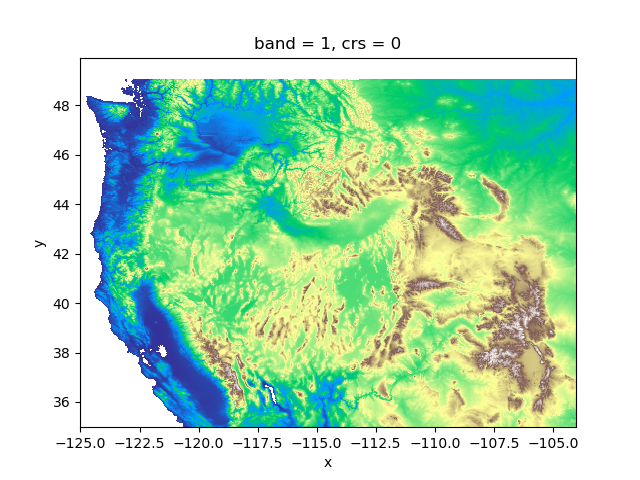
The dem has coordinates of latitude and longitude. If we visuzlize the DEM as-is, it looks ok using the standard matplotlib “terrain” cmap:
fig,ax=plt.subplots()
prism_dem.sel(x=slice(-125, -104), y=slice(55,35)).plot(cmap='terrain', add_colorbar=False)
But, I would like to make it look better using hillshading.
First, we will make a custom matplotlib colormap. A color map translates numbers (in this case elevation or amount of topographic shadow) into colors in some logical way. Any color can be specified using hue, saturation, and value (https://en.wikipedia.org/wiki/HSL_and_HSV). For hillshade purposes, it is better to use a colormap that has color values with uniform lightness values, but varying hues. In this way, overlaying the hillshade on top will then change the light and dark values to emphasize terrain without interfering with the colors of the DEM. None of the stock colormaps in matplotlib seem to be good for this task, so you will need to create your own. This is one function that creates a custom color ramp:
def make_Ramp(ramp_colors):
    from matplotlib.colors import LinearSegmentedColormap
    color_ramp = LinearSegmentedColormap.from_list('my_list', ramp_colors)
    # uncommenting these will display the colorramp
    # plt.figure( figsize = (15,3))
    # plt.imshow( [list(np.arange(0, len(ramp_colors) , 0.1)) ] , interpolation='nearest', origin='lower', cmap= color_ramp )
    # plt.xticks([])
    # plt.yticks([])
    return color_ramp

# the codes are html color codes and can be found on many websites
custom_ramp_terrain = make_Ramp(['#9b9b9bff', '#65ac6fff', '#c3c36dff', '#aca378ff', '#998881ff', '#8e938fff', '#7aa6a6ff', '#ffffffff'])
gray_ramp = make_Ramp(['#000000', '#ffffff00'])
There are two custom colormaps, one for the terrain and one for the hillshade. The hillshade colormap ranges from transparent white to gray. You can experiment with these to tune to your liking. I’m less interested in showing the low elevations of the western US for this map, otherwise I might change the colors around for the lower limit of the colormap.
This is what the DEM looks like with the custom colorbar from above:
fig,ax=plt.subplots()
cb=prism_dem.sel(x=slice(-125, -104), y=slice(55,35)).plot(ax=ax, add_colorbar=True, cmap=custom_ramp_terrain, vmin=0, vmax=4000, alpha=1)

This is ok, but the topography doesn’t really “pop” like it does in a hillshade map. We can then use the matplotlib “lightsource” function to achieve this:
from matplotlib.colors import LightSource
ls = LightSource(azdeg=270, altdeg=45)
cmap = plt.cm.gist_earth
z = prism_dem.sel(band=1).values
dx = prism_dem.x.values
dy = prism_dem.y.values
ve=.00009000  # "vertical exxageration". this number will change depending on your DEM resolution and units

# this is the hillshade layer
hillshade = ls.hillshade(z, vert_exag=ve, dx=dx, dy=dy)

# this looks weird, but we are just doing this to convert everything into an xarray object to
# enable easier plotting and manipulation later
dem_hillshade = prism_dem.astype(float).copy()
dem_hillshade.values[:,:] = hillshade[:,:]
Now we can plot the DEM and the hillshade layer together. There might be a way to “blend” the two layers as is done in QGIS and other graphics programs, but I’m not aware of that functionality at the moment. We can just change the opacity of the top layer to get a close-enough effect, however.
fig,ax=plt.subplots()
dem_hillshade.sel(x=slice(-125, -104), y=slice(55,35)).plot(cmap=gray_ramp,ax=ax, add_colorbar=False)
cb=prism_dem.sel(x=slice(-125, -104), y=slice(55,35)).plot(ax=ax, add_colorbar=True, cmap=custom_ramp_terrain, vmin=0, vmax=4000, alpha=.5)
And now we have a map that looks like this:
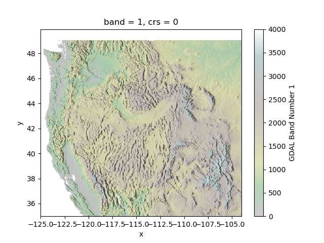
This can probably be improved substantially by tweaking the opacity and the color ramps. I think that the colors look a little bit too muted, but for my current purposes I’m satisfied.
Hopefully this was helpful.